
Approach · Climbing gym software
Customer Header
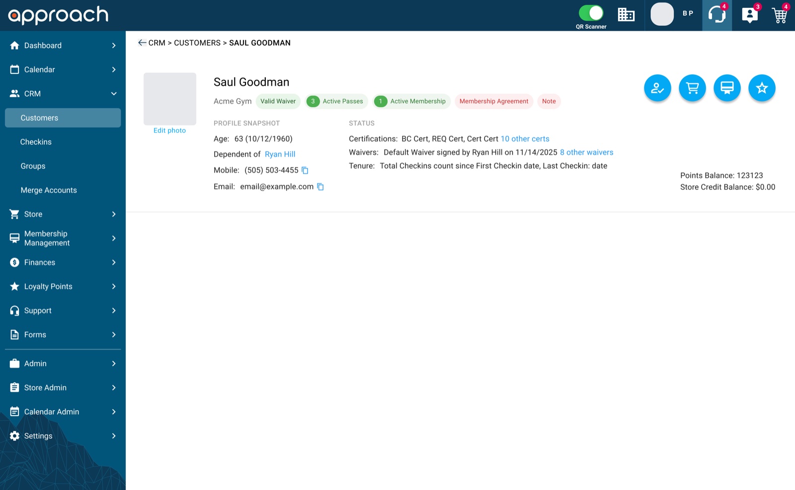
Showing everything front desk staff need to know about a customer at a glance, without digging through tabs.
Problem
Key information like waivers, agreements and notes was spread across tabs, so staff had to click around to know if a customer could check in.
What I did
Redesigned the header’s structure, the status chips and their colors, and the variants for every account state the front desk runs into.
Result
A header that answers “can this person climb today?” at a glance, and flags what needs action before the customer gets to the wall.
Context
The customer header sits at the top of every profile in the admin app. At the front desk, it’s the first thing staff look at when someone walks in: who they are, whether their waiver is valid, and whether they have a pass or membership.
Gym operators asked for one thing in particular: put the account’s status, pass balance and important notes directly in the header.

The problem
- Information spread across tabs. Expired waivers, unsigned agreements and staff notes lived in other sections of the profile.
- Slow at busy times. Checking each tab for every customer created lines at the front desk during peak hours.
- Compliance risk. When a missing waiver or agreement is easy to miss, staff can let someone in who shouldn’t be.
Constraints
- Fixed height. The header couldn’t grow, or it would push the rest of the profile tools below the fold.
- Existing design system. Colors, type and icons had to come from the current component library.
- People linked to people. A parent can buy for a child, so passes, waivers and agreements may belong to different people on the same account.
Key decisions
1. Status chips with color, right under the name
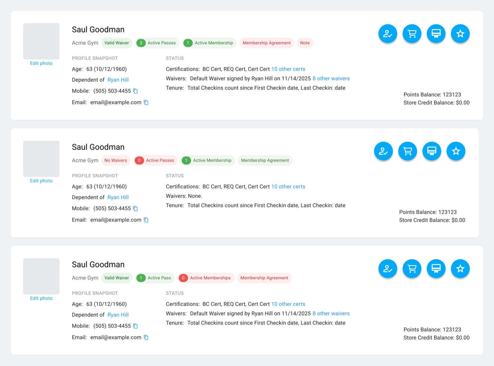
Waiver, passes, membership, agreement and notes became chips in a fixed order. Green means valid or active, red means missing or needs action, and counts sit inside the chip, so staff recognize the pattern without reading full sentences.
Discarded Status as lines of text, like in the old header, and alerts inside other tabs or blocking pop-ups. Text forces staff to stop and read, tabs are easy to overlook, and pop-ups interrupt staff who open the profile for other reasons.
2. Two labeled columns to keep the height fixed
Details are split into a Profile snapshot (age, who the customer depends on, phone and email) and a Status column (certifications, waivers and tenure). Long lists show the most recent item plus a link like “10 other certs”, so the header never grows.
Discarded Listing every certification and waiver in full. It looks complete, but one long history would push the rest of the profile down the page.
3. A light way to copy contact details
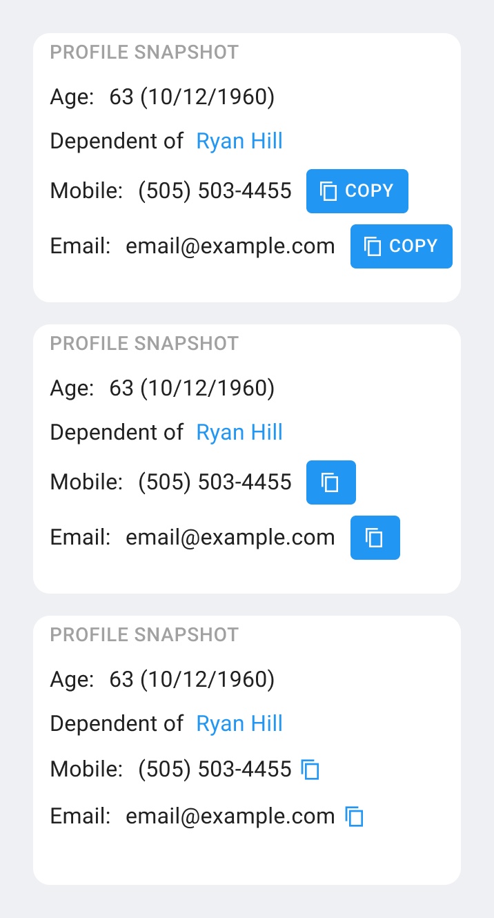
Staff often copy a phone number or email into another tool. I explored a text button, a filled icon button and a small inline icon, and went with the inline icon next to each value.
Discarded The “Copy” buttons. They were the most obvious, but added a lot of visual weight to a part of the header people read many times a day.
The solution
- Identity: photo, name and home gym, with quick actions for check-in, store, memberships and loyalty on the right.
- Status chips: waiver, passes, membership, agreement and note, always in the same place and order.
- Profile snapshot and status: the details staff need most, with links to the full history.
- Balances: points and store credit stay visible in the corner.
- One component, many states: each account situation is a variant, so engineers and designers use the same source.
Outcome
- Staff can tell if a customer can check in without leaving the header.
- Missing waivers and unsigned agreements are flagged before the customer gets to the wall.
- The design was approved in design reviews and added to the main design files as a reusable component.